The Golden Ratio and CSS Aspect Ratios: The Geometry Behind Modern Web & Graphic Design
How a 2,500-year-old mathematical constant shapes modern digital screens, typography hierarchies, and responsive layouts.
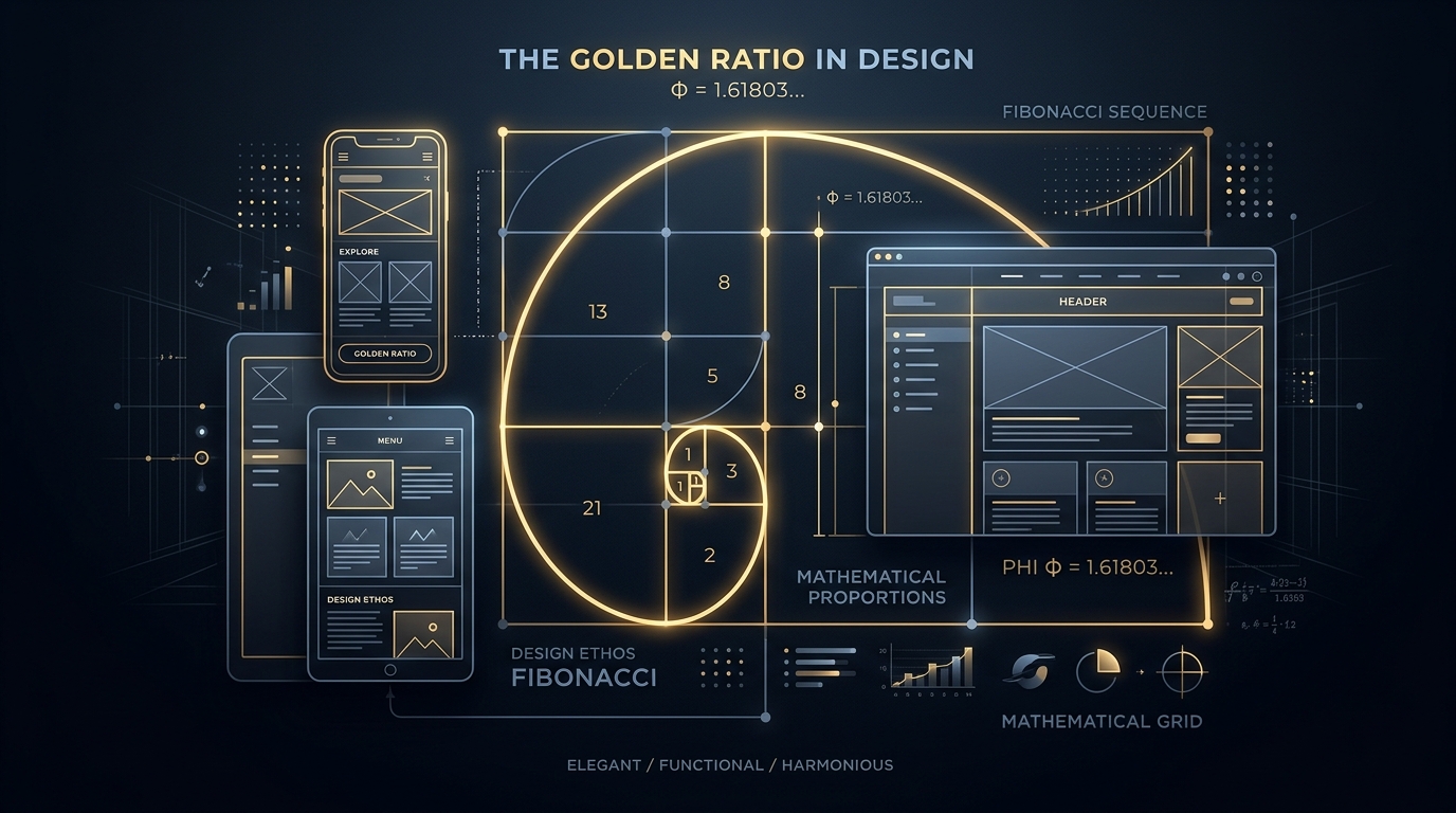
Visualizing the Golden Spiral ($\Phi \approx 1.618$) mapped against responsive UI wireframes, viewport containers, and mathematical grids.
Have you ever landed on a website or viewed a mobile app interface that felt instantly calming, polished, and instinctively natural—even before you read a single word of copy? You might attribute that pleasant sensation to good typography or clean color choices. Yet, beneath the visual surface of world-class design lies a silent mathematical framework that human brains have found captivating for millennia: geometric proportionality.
From the Parthenon in ancient Athens and Leonardo da Vinci’s Vitruvian Man to Apple’s hardware silhouettes and Twitter’s original responsive grid, the Golden Ratio ($\Phi \approx 1.61803398875$) has served as humanity’s universal blueprint for visual balance.
In modern front-end web development and digital UI/UX design, understanding proportions is not merely an artistic indulgence—it is a practical engineering tool. It dictates how responsive containers scale without jarring layout shifts, how modular typography creates effortless reading rhythm, and how multi-column dashboard layouts feel cohesive across mobile phones, tablets, and 4K ultra-wide monitors.
1. What Is the Golden Ratio? The Constant of Nature
Geometrically, two quantities $a$ and $b$ (where $a > b > 0$) are in the Golden Ratio ($\Phi$) if the ratio of their sum to the larger quantity equals the ratio of the larger quantity to the smaller quantity:
Solving this quadratic equation ($x^2 - x - 1 = 0$) gives the exact value:
What makes this number astonishing is how frequently it manifests in the natural world. Seed spirals in sunflowers, nautilus shell chambers, pinecone scales, hurricane satellite imagery, and spiral galaxies all mirror logarithmic spirals built on $\Phi$. Because natural organisms grow incrementally while maintaining their structural form (a property known as self-similarity), the Golden Ratio is nature’s most efficient growth algorithm.
2. The Fibonacci Connection: The Discrete Stepping Stones
While the Golden Ratio is a continuous, irrational number, its discrete counterpart is the famous Fibonacci Sequence, published by Italian mathematician Leonardo of Pisa in 1202:
0, 1, 1, 2, 3, 5, 8, 13, 21, 34, 55, 89, 144, 233, 377...
Each successive number is the sum of the two preceding numbers (Fn = Fn-1 + Fn-2).
As you divide any Fibonacci number by its immediate predecessor, the resulting quotient rapidly converges toward the Golden Ratio:
- 5 / 3 = 1.6666
- 8 / 5 = 1.6000
- 13 / 8 = 1.6250
- 21 / 13 = 1.6153
- 55 / 34 = 1.6176
- 144 / 89 = 1.61797...
When you arrange adjacent squares with side lengths equal to Fibonacci numbers (1, 1, 2, 3, 5, 8, 13, 21...) and draw continuous quarter-circle arcs through their opposite corners, you construct the iconic Golden Spiral. In web design and photography, this curve acts as a natural visual path, guiding the viewer's eye smoothly from broad contextual space to a tight focal point.
3. Applying the Golden Ratio to Web Page Layouts
How does a web designer translate $\Phi = 1.618$ into real-world CSS grids and column widths? The most common application is splitting a content container into a primary content zone and a secondary sidebar.
Suppose your desktop layout container has a total width of 1200 pixels:
741.6 px (~61.8%)
1200 px / 1.618 = 741.6 px. Ideal for articles, code viewers, and rich media.
458.4 px (~38.2%)
1200 px - 741.6 px = 458.4 px. Perfect proportion for table of contents or widgets.
This 61.8% to 38.2% division feels substantially more organic than an arbitrary 50/50 split (which feels static and divided) or a 75/25 split (which can make sidebars feel cramped and secondary).
4. Modular Typography Scales: The Mathematics of Font Hierarchy
One of the biggest stumbling blocks in UI styling is choosing font sizes. Designers often guess values arbitrarily (e.g., 14px, 18px, 22px, 36px), producing inconsistent visual rhythm where headings either shout too loudly or blend into paragraphs.
Professional typography systems utilize Modular Scales. Starting from a base font size (typically 16px or 1rem), every higher heading and smaller caption is computed by multiplying or dividing by a constant scale ratio:
| Scale Name | Ratio | Example Hierarchy (Base 16px) | Best Use Case |
|---|---|---|---|
| Major Second | 1.125 | 14px • 16px • 18px • 20px • 23px | Dense data tables, dashboards |
| Major Third | 1.250 | 12.8px • 16px • 20px • 25px • 31.25px | Standard SaaS applications & documentation |
| Perfect Fourth | 1.333 | 12px • 16px • 21.3px • 28.4px • 37.9px | Blogs, marketing sites, landing pages |
| Golden Ratio | 1.618 | 9.9px • 16px • 25.9px • 41.9px • 67.8px | Editorial publications, high-impact hero sections |
When you use a modular scale, mathematical harmony is baked directly into the stylesheet. Your h1, h2, h3, and body tags maintain a proportional relationship that feels intentional and readable.
5. The CSS aspect-ratio Property: Taming Responsive Layouts
For decades, maintaining fixed proportions for responsive elements on the web was notoriously difficult. Developers had to rely on the clunky "Padding Hack":
Fortunately, modern browsers now support the native CSS aspect-ratio property. It allows you to define explicit width-to-height constraints in a single clean declaration:
⚡ Preventing Cumulative Layout Shift (CLS)
By specifying aspect-ratio on image and video wrappers, the browser calculates the reserved vertical layout height before the image asset finishes downloading. This eliminates annoying layout jumping (CLS), directly boosting your website's Google Core Web Vitals score!
6. Standard Aspect Ratios in Modern Digital Media
Beyond the Golden Ratio, specific aspect ratios have become industry standards across hardware displays and media formats:
📐 16:9 (1.778) — High Definition Video Standard
The universal standard for YouTube, Netflix, digital TVs, and computer monitors. Balances human peripheral vision with cinematic wide-angle framing.
📐 4:3 (1.333) — Classic Photography & Tablets
The native capture ratio of Micro Four Thirds cameras and Apple iPad screens. Provides ample vertical real estate for reading and productivity.
📐 1:1 (1.000) — The Square
Popularized by Instagram, product thumbnails, e-commerce catalog grids, and user avatar profile badges.
📐 9:16 (0.562) — Mobile Vertical Video
The default orientation for smartphone screens, TikTok, YouTube Shorts, and Instagram Reels.
7. Summary Checklist for Designing with Proportions
- ✓ Establish a Base Unit: Use an 8px or 4px spacing grid combined with a modular typography scale.
- ✓ Anchor Hero Content: Use Golden Ratio proportions (1 : 1.618) to divide primary content from secondary support elements.
- ✓ Enforce Native CSS
aspect-ratio: Always reserve container dimensions to avoid layout shifts. - ✓ Test Across Breakpoints: Remember that geometric proportions can shift gracefully; a two-column 1.618 split on desktop can cleanly stack into a single column on mobile viewports.
8. Calculate Aspect Ratios and Proportions with DayLogic
Need to calculate dimensions for responsive images, resize video embeds, or convert between pixels and root-em typography units?
DayLogic’s Design & Math Tools include an intuitive Aspect Ratio Calculator, Rem-to-Px converter, and Golden Ratio dimension finder to streamline your development workflow.
Master Your Layout Geometry
Calculate aspect ratios, convert typography scales, and balance UI dimensions with DayLogic Design & Math Tools.
Explore Design & Math Tools